
Sunday 28 October 2012
Romney-Ryan 2012
It's been a great week for politics in the U.S. and my sister has been lucky enough to visit Washington and CNN studios in Atlanta. I've been glued to the computer drawing and watching the news updates, here's something I whipped up the other day (why did I not draw paul Ryan sooner?). Not a single week goes by where I read something about Donald Trump without wanting to punch him in his orange face;
Saturday 27 October 2012
Learning About Lighting
This month I've learnt quite a lot about lighting so I thought I'd put together this post as a summary of my findings so far. Despite having read a lot of critiques of lighting in live action films such as "Blade Runner" I had not read much about lighting techniques or about using lighting in my drawings. In the past I've always drawn the areas of light and dark where I sort of think they look right without putting any thought into the light sources or the surrounding environment, the lighting in my work was very sketchy and didn't make much sense. As I researched the work of Mark Mignolia, Sam Keith, Frank Miller and many other artists I began to realise that I was lacking a very important tool especially when it comes to drawing cartoons without a well lit reference image.


I began by flicking through my many "how to draw..." books but I struggled to find anything which properly explained how lighting works (many would say "use dramatic lighting" but wouldn't give much more of an explanation). I went to the library and found some books on basic lighting for photographers, each page had a photo and a diagram explaining the lighting set up, after spending some time studying each picture and the lighting set up everything began to click into place.
So now I'm experimenting a lot with lighting, I find it's best to draw a quick sketch of the scene first and then workout a lighting plan before adding shadows, I think this will be very useful for my section of the Deep project.
An example of a lighting plan;
A quick sketch based on the lighting plan;
Some more recent sketches;
Wednesday 24 October 2012
More Title Sequence Images
Mood boards for the each period of Mike Tyson's life;


 Recent concept images;


Tuesday 23 October 2012
Pre-Production Project

This year I have chosen to do the Pre-Production option, we have been given random cards with characters, settings, genres and styles and we have to combine the things on our cards to make an idea for an animation. I got "Prison Guard", "Nail Salon", "Winsor McCay" and "Pre School" (we were allowed to flip one card and "pre school" was changed to "dark comedy").
Winsor McCay was a comic illustrator in the early 1900's and one of the first people to bring animation to the public audience with his animated character "Gertie the Dinosaur". I studied his style and I found I was most interested in his earlier drawings of "Nemo the Clown", these drawings were in black and white and were drawn with a bold black outline.
For my story I decided it would work best as a T.V. show about a nail salon run by prisoners (I got the idea from a T.V. show where Gordon Ramsay taught prisoners to cook). As research I watched a couple of documentaries about American prisons which are run by private companies and full of tattooed gang members. One of the documentaries featured an overweight, Texan prison guard who addressed the prisoners as "Boy", I thought he would be a really entertaining cartoon character so I did a few drawings of him;


I liked the idea of including this character but I didn't think it would really suit his character to have him starting a nail salon so I designed a second prison guard. This prison guard is called Daryl and he's the prison therapist, he believes that the prisoners are just misunderstood and he's far too patient with them. I thought that having two completely opposite characters running the prison would be entertaining and could be the source of a lot of the comedy.


As I watched the prison documentaries I couldn't help but think that they only seemed to focus on the thuggish, violent criminals with tattoos from under-privileged backgrounds so I thought I should also include some other types of criminals. The drawing below is of a pair of Wall Street bankers who are in prison for insider trading.

Tuesday 9 October 2012
Latest "Tyson" Work;


1) An idea for the title card, I think this works well because it's very simple and the chipped and fractured lettering with the blood spattered background reflects the tone of the animation.
2) A concept piece, (the final animation won't be this detailed or scribbly) Stu suggested using projection mapping to add a slight camera move on one of these freeze frame shots which would look awesome!
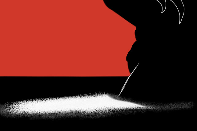
3) The last 3 pictures are for an idea I had in which the silhouette of a young Tyson grows into his adult self as the camera cranes upwards making the city infront of him shrink as he grows, I tried it with a few different colour combinations.
Wednesday 3 October 2012
Title Sequence Project
Today we were given the brief for our second year project. In (randomly assigned) groups of three (I'm with Stu Whitten and Norwegian Elizabeth) we have to make an animated title sequence for either; a T.V. show based on H.G. Wells era science fiction, a Radio 4 program which has been adapted into a T.V. show or a biopic.
Recently I read a review of Mike Tyson's one man show and ever since I've been doing some research about him, I think he's a really interesting character and tragic character and I've always found it strange that he's practically worshipped by young men despite his reputation for assaulting women. A while ago I drew a caricature of Tyson and when Andy (my lecturer) mentioned biopic the name "Mike Tyson" instantly popped into my head.

So why Mike Tyson? Well the first reason was because he's an incredibly iconic figure who's known for having a tattoo on his face, biting off people's ears and having a soft spot for pigeons, as I walked home from campus I had a lot of ideas about how to bring all these elements together to create a short title sequence.

Above is the initial concept which I drew as soon as I got home, it's very rough but I think it sums up my idea. I had quite a few things in mind; Frank Miller's "300" comic, the title sequence from Casino Royale and the poster for Quentin Tarrantino's "Django Unchained". I really like using silhouettes at the moment and I'm trying to make my compositions as bold as possible. The drawing above is a rough scribble of my initial idea. Below is an idea for a shot where Tyson walks towards the camera whilst pigeons fly across the shot behind him.

Other ideas I have include Tyson punching several men to the ground and then a woman and being handcuffed and Tyson punching a punchbag in the shape of a whiskey bottle (there's going to be a lot of punching). The colour scheme is currently based around black red and white, I like the idea of Tyson being portrayed as a black silhouette (not racist) with his face tattoo in white. It's early days and I've literally done these within a few hours of leaving the briefing but even if we go with a different idea I've still enjoyed mocking up these concept pieces!

Recently I read a review of Mike Tyson's one man show and ever since I've been doing some research about him, I think he's a really interesting character and tragic character and I've always found it strange that he's practically worshipped by young men despite his reputation for assaulting women. A while ago I drew a caricature of Tyson and when Andy (my lecturer) mentioned biopic the name "Mike Tyson" instantly popped into my head.

So why Mike Tyson? Well the first reason was because he's an incredibly iconic figure who's known for having a tattoo on his face, biting off people's ears and having a soft spot for pigeons, as I walked home from campus I had a lot of ideas about how to bring all these elements together to create a short title sequence.
Above is the initial concept which I drew as soon as I got home, it's very rough but I think it sums up my idea. I had quite a few things in mind; Frank Miller's "300" comic, the title sequence from Casino Royale and the poster for Quentin Tarrantino's "Django Unchained". I really like using silhouettes at the moment and I'm trying to make my compositions as bold as possible. The drawing above is a rough scribble of my initial idea. Below is an idea for a shot where Tyson walks towards the camera whilst pigeons fly across the shot behind him.
Other ideas I have include Tyson punching several men to the ground and then a woman and being handcuffed and Tyson punching a punchbag in the shape of a whiskey bottle (there's going to be a lot of punching). The colour scheme is currently based around black red and white, I like the idea of Tyson being portrayed as a black silhouette (not racist) with his face tattoo in white. It's early days and I've literally done these within a few hours of leaving the briefing but even if we go with a different idea I've still enjoyed mocking up these concept pieces!
Deep Project Work Continued....
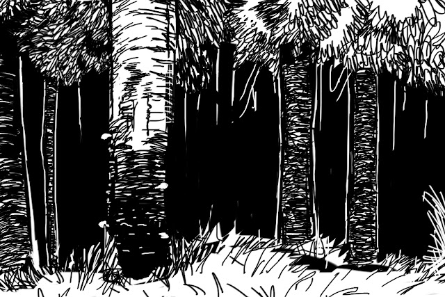
I learnt a lot from the digital painting in Edward Hopper's style but the director decided to use a different style for that scene. I was then given the "Hellboy" style scene which I'm incredibly excited about because I love the work of Mark Mignolia. The scene takes place in a snowy forrest so I did a few rough drawings in different comic noir styles and I'll pursue which ever one Derek prefers. I also drew two of the mobsters but I haven't seen a storyboard yet so I'm not sure what I need to be drawing in the scene.


Deep Project Work
Over the summer I've been involved with a short film directed by one of my lectures Derek Hayes. The film is made up of sections in several different styles and genres of live-action and animated film, I've been doing some backgrounds and soon I'll hopefully get to do some character designs as well!
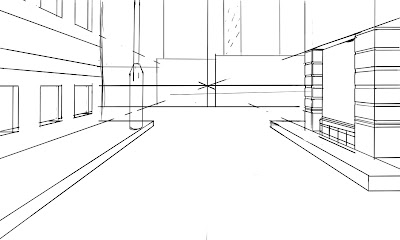
The first background I was given was in the style of American painter Edward Hopper, I began by sketching out a street with similar architecture to the buildings featured in his work then I used a ruler to make a line drawing of the street which I could paint;

Then I studied Edward Hopper's style and developed a technique using several layers on Sketchbook Pro which resembled his paintings;


The first background I was given was in the style of American painter Edward Hopper, I began by sketching out a street with similar architecture to the buildings featured in his work then I used a ruler to make a line drawing of the street which I could paint;
Then I studied Edward Hopper's style and developed a technique using several layers on Sketchbook Pro which resembled his paintings;


Subscribe to:
Posts (Atom)