Sunday 27 May 2012

Some more concept art...


Motion Studies Showreel

This showreel contains all the motion studies animations I made this term;

Ident Project

For this project the task was to create a 7-10 second ident promoting digital animation at Falmouth using footage from the experimental animation.

11 Second Club Rough Animation

This is my rough animation for this months 11 second club (I still need to lip sync it and sort out a few things).

3D Projection Mapping

For this project I had to take a photo of a building and project the photo onto a 3D model of the building in maya. I also had to produce a matte painting as a background so that it looked as if the building had been placed in different surroundings. If I'm honest I didn't really excel at this project and I got very lost and confused quite a bit. In the end I decided to put the building underwater so that I could sort of hide that the building wasn't projected very well. I used a picture of sand for the floor and did a matte painting of an underwater background; unfortunately it you can't see the matte painting because I got the water density wrong. Although the end result wasn't what I really wanted I learned a lot during the project.


Background Design Project

This term I have had to work on a background project as part of my animation course. The backgrounds had to be related to a project. The task was to produce an exterior monochromatic background, an outline plan of a background and an interior background. I did the the monochromatic background first as I had an idea for a dark street; I began by sketching out an outline and then I coloured in the darker and lighter areas in different shades of blue. I then added in the darkest areas using black and created glowing streetlights using the airbrush tool. For the outline I drew the deck of the pirate ship from my storyboard project and for the interior I drew the inside of the pirate captains cabin.


Truro Cathedral Project


For the Cornish stories project my group chose to animate to the soundtrack of a fisherman talking about a day of fishing. I established the role of character designer/character animator within the group and began by designing the main character.

We originally intended to use a soundtrack in which a fisherman kills fish with a screwdriver so I designed this as an early piece of concept art;


 I designed the fisherman in this sketchy, illustrative style as I thought it would appeal to young children. I used a muted colour palate so that the animation would have a rustic, naturalistic feel that I thought would compliment the story, I was cautious about not using too many bold black lines and garish, bright colours as I thought it would make the animation look cheap and unprofessional.
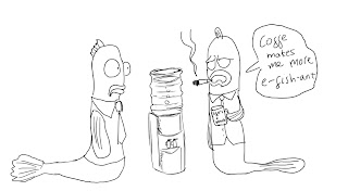
Having decided on a different soundtrack I began designing a new fisherman, some underwater backgrounds and the boat for the project;
The fisherman in the sound file is very relaxed and nonchalant and I thought that drawing him looking constantly bored would add some humor to the animation. I based the character on the old fisherman I see at harbors when I go sailing in Scotland, I originally wanted him to look very old and withered but I simplified drawing so that it would be easier to draw repeatedly when animated. I decided to draw him with a pipe constantly in his mouth as it adds to his stereotypical nautical persona but I did not draw any smoke coming out of the pipe as Truro cathedral probably doesn’t want to encourage smoking. The pipe also worked well as a prop as the fisherman could move it around in his mouth when thinking and it drops to the floor when he is surprised.
The images below are some concept drawings I did of the fishing boat and a background concept for under the sea;


Having assigned roles within the group I produced a colour palette for everyone to use, I felt it was important that the whole animation had the same style and look. I then began creating concept art for certain scenes so we could begin planning layouts and storyboarding, for one scene the camera pans to a shot of a crowded area under the sea so I drew the picture below as an idea for one of the jokes; the idea was to have as many famous fish from other animations as possible in one shot although this shot was not used in the final production as it breeched the copyrights of several franchises.
Instead I drew up a series of visual jokes based around the fish being underwater, the idea was to go for the scattershot approach and have so many ridiculous characters that every time the audience watched the animation they noticed something new. Below is a selection of the fish sketches that I gave to Jake Teale to colour;


At one point in the animation the camera pans across to an area that the fisherman says contains no fish, we wanted a there to be something funny under the water to liven up the scene so I did a drawing of an extremely ugly mermaid smoking a cigarette, I used the same colours as the mermaid from the Disney film “The Little Mermaid” and drew it in a similar pose to a still from the film;


Another scene in which I was required to create a series of funny visuals was the scene in which the fisherman arrives at his “secret spot” to find that it is already overcrowded with other boats. The original idea was to have several boats with the similar looking fisherman onboard but we instead decided to have several boats containing various caricatures of nautical stereotypes. Alex Watkins drew the background and the boats and I drew the various characters over the top, for the scene we decided to use limited animation and jut have a few of the characters blinking to add some movement to the scene. Aboard the boats I drew a gnome fishing, a pirate, a sponge (as a homage to Sponge Bob Square-pants), a naval captain and his first mate and Titanic II drifting towards an ice cube. I tried to make the drawings recognisable without plagarising.


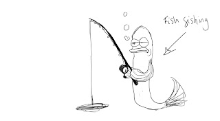
My next task was to animate and colour the fisherman in all the characters scenes; I began by drawing out the keyframes for each scene, I would then draw the inbetweens and then go back and colour each frame. Below are the key poses from a yawn sequence;
 
The original plan was to animate the project in Toon Boom although we eventually decided that because of the small amount of animation required it would be easier to draw the frames in sketchbook pro or photoshop and then animate them in flash. The project was composited by Alex Watkins using Adobe Premiere and much of the animation was achieved using symbols rather than frames.
For some of the scenes I drew the foreground where very little or no animation was needed (the petrol station pump, the fisherman rolling up his sleeve to look at his watch, the sun and moon), a few of the scenes I drew were eventually cut from the animation including the scene below in which a seagull looks round;


I found that the most challenging aspect of the project was drawing animating a 2D character for the 3D projection mapping of the boat; I drew a series of turn-arounds for the character at the beginning of the project and I used these as a reference when drawing the character from several different angles. Animating the character was also a very tedious process as I chose to draw the frames in Sketchbook Pro using the layer as an onion-skinning tool, although the process worked it meant that the frames had to be saved and catalogued every time a drawing was finished. I think if I was going to work on a similar project again I would make sure someone else had the job of colouring the frames as having to both draw and colour the frames significantly slowed down my workflow.

I really enjoyed working on the project and I would like to work on a 2D animation again.

Friday 11 May 2012

If you've been wondering about all the pictures of Harvey Kietel on the blog they are because for the past couple of months I've been developing drawings for a personal project based around Abel Ferrara's film "The Bad Lieutenant". At the moment all I have is a few ideas and a tonne of drawings but I'm going to continue working at it and see where it leads.

Below is my latest concept piece and the others which accompany it;


Ipad + Nomad brush

Recently I've been doing a lot of drawing using my Ipad and a nomad brush (big thanks to the Stanleys for getting me the brush for christmas!) after a lot of practice I think I've mastered using the brush. Unlike a drawing on paper the thickness of the line is determined by how fast it is drawn instead of how hard you press down which really suits my style.

Here's a picture of the actor Danny Trejo I drew the other day on Sketchbook for Ipad;


Captain America

After watching the avengers last week I did this cartoon of Captain America, I like to think of him as freedom loving 'merican.


Experimental Animation


High quality link to my animation; https://vimeo.com/41096193


For my experimental animation project I wanted to create a stop motion animation using various art materials. I had not tried animating using stop motion before and my main concern was that the timing would not match up to the soundtrack provided.
The soundtrack I decided to use was a piece of experimental music that did not seem to have any rhythm or melody that I found made it unpleasant to listen to. For this reason I decided it would be perfect as the backing track to a war zone scene because of the loud, industrial sounding noises and low whistling noises which reminded me of bombs being dropped.

To begin with I scoured the Internet for free audio samples of explosions, gunfire, aircraft noises and people screaming. I then used Audacity sound editing software to create a sound file featuring the experimental music with the sound effects playing at varying volumes. I was inspired by a short animation by Tourist Pictures in which the abridged history of The United States’ military conflicts were represented by the food of the respective nations attacking each other (for example; the attacks on Pearl Harbor are represented as sushi being fired at burgers). The animation had been created by photographing food and then key-frame animating the photographs within Adobe After Effects, allowing food to fly through the air and the animation to be very smooth.
I had an idea for a short narrative in which two armies made of stationary attack each other although when I began to work out set layouts and concept stills I realized that the audience would not be able to tell the difference between the two armies and that the shots looked overcrowded. I instead decided that the animation would feature an army made out of stationary attacking small villages made of plain white paper and with this in mind I edited the soundtrack. The only camera available as I animated the project was my digital camera that does not have a manual focus because of this I had to keep set designs simple as the camera would only focus on what was immediately in the foreground and would sometimes blur. I decided to use cones made of white paper for the village as the simplistic, primitive design contrasted nicely with the ugly, garish machines that attack.

As I began to take the first photographs I realized that I needed to move the set to a place where I could control the lighting as constantly changing sunlight caused the animation to flicker to prevent this I moved the set to my attic as it has no windows. I planned out in the animation as a series of short scenes each lasting a few hundred frames or less and I made various camera rigs and dollies so I could create panning and tracking shots. The most challenging shots were the ones in which the camera tracks behind flying missiles and planes; for these I mounted the camera on a music stand and attached the object it was tracking in the foreground of the shot using a wire coat hanger, this meant that as the camera moved forwards the missile always stayed in the same place as the background drew closer. For other shots where I needed to have objects flying I either partially photographed the object (so that the place where it was attached to the floor or ceiling was out of shot) or had the object attached to the floor with blue tack and a toothpick.
To create the explosions I cut out rough circles and coloured them yellow with red centers and borders, I then photographed them and then ripped the edges so they were slightly smaller and coloured the borders again. For scenes in which there were fires I made several cut-outs of frames which varied in size, I photographed them around the buildings then randomly swapped there positions round so that it looked as if the flames were flickering and never stationary and for smoke I ripped up tissue paper and increased the amount around the buildings each time it was photographed.


I was happy with the final result but found that not all of the explosions synced with the visuals so some sequences had to be repeated so that there would not be gaps. The final part of the animation in which a bomb flashes before exploding did not end up playing properly when animated as I had got the timing wrong so I had to hold a still image for a few frames and alternate between two pictures to make it flash. Unfortunately editing software was not available as I was photographing the project and I only realised I had this problem when I got back to university. During the project I learnt a great deal about the importance of planning and timing; I found that even a problem with a single frame effects the overall animation.